“Yer gotta larf, han’t yer…,” writes Hugh
And because he may be right.
And because the worst thing any of us can do
is promote authenticity or inauthenticity, on questionable information.
On the other hand . . . well, let’s be sure, now and thanks for the opportunity.
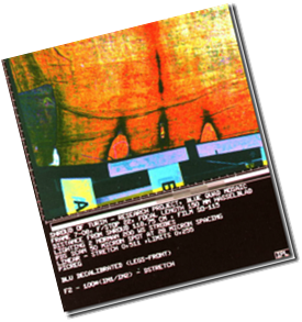
The six quad mosaic images are at https://www.shroud.com/gallery/index.htm, close to the bottom. Two of them are enlargements of others. Three of the remaining four show exactly the same colouration: namely a pale blue upper, bright yellow middle and orange base, with green lower left-hand corners. The fourth has a blue central smudge which does not extend as far as the other three.
In his article “Some Details about the STURP Quad Mosaic Images” (https://www.shroud.com/pdfs/quad.pdf) Barrie Schwortz quotes Jean Lorre, as follows:
“There was a strong illumination brightness falloff from the centre. This was eliminated by dividing each image by a flat field.”
Well it wasn’t, was it? Each of the images is brighter in the centre than it is around the edges. The flat field process may have diminished the brightness falloff, but it didn’t eliminate it, and that’s important. What Lorre is clearly explaining is what was hoped, or expected, not what actually happened. Let’s go on.
“We wanted to enhance the colour to reveal subtle colours which might betray spatial variations in chemical composition. […] we greatly exaggerated the colour saturations while preserving the original hues and intensities.”
A noble idea, but it didn’t work. Lorre wishes so much that it had, that he loses all touch with his own images in his next sentence.
“These colour images should be interpreted as a chemical composition map.”
Shall we take him at his word? Shall we agree that the blue bands across the top of three of the quad images really represent different chemicals from the yellow and orange below them? What might these blue bands be? They may be found across the front of the thighs, the head, and the buttocks. Shall we?
Or shall we agree that the illumination of the areas of the shroud by the photographic lights are responsible, and the colours have nothing to do with the chemical composition of the shroud at all.
Oh, and the image described as “ultraviolet” by Rogers? It’s the shape of the patches which gives it away. It’s the one captioned Quad Mosaic Dorsal Legs, which shows the bloodstained feet at the top, and nearly reaches the buttocks at the bottom. The camera zooms meaningfully into the bottom left hand corner of this image, apparently under the impression that it is looking at the medieval patching of the radiocarbon corner.
Yer gotta larf, han’t yer…
or cry!

